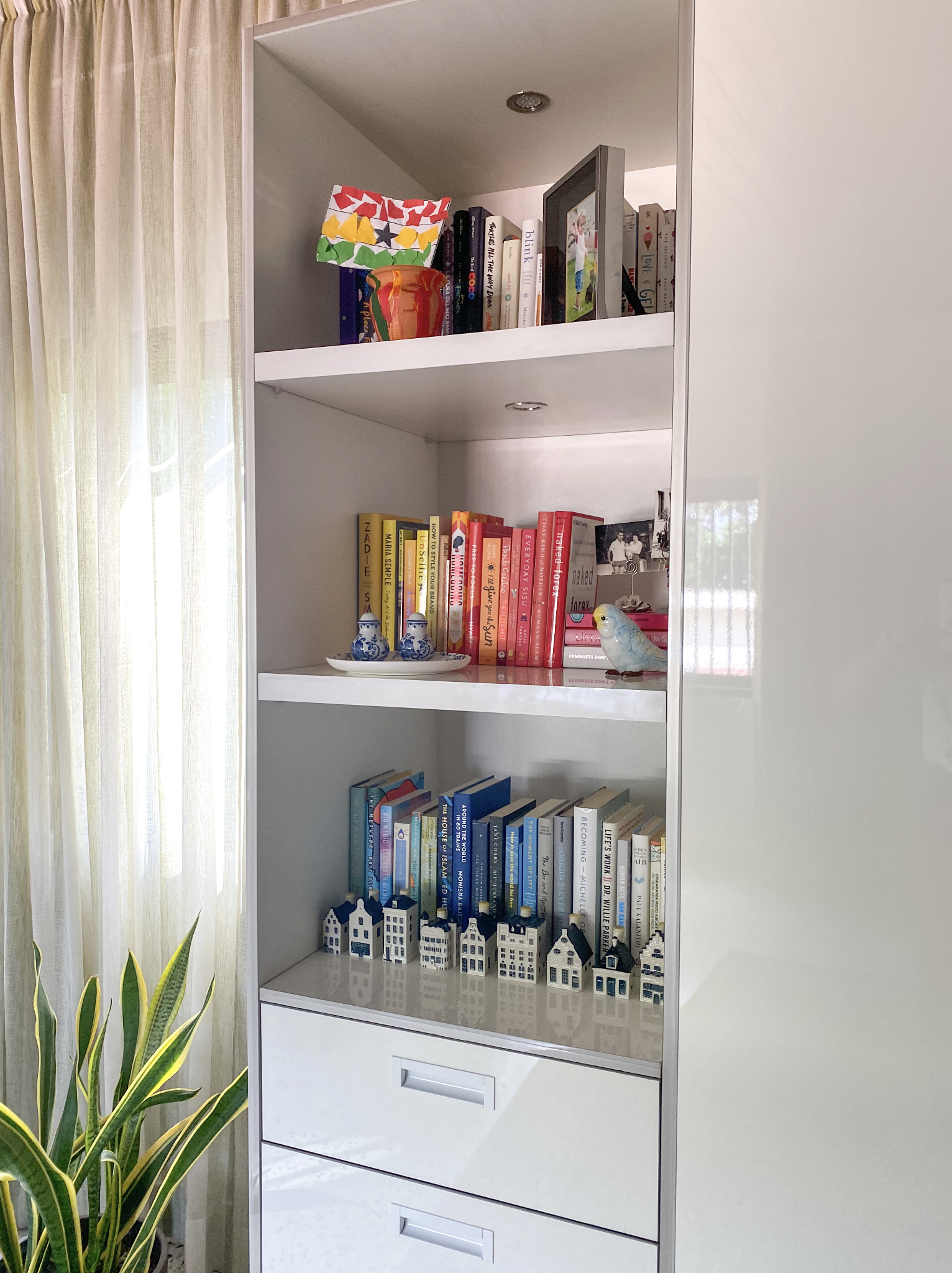
ProCraft interiors specialise in interior finishes for homes and commercial spaces. I had the pleasure to work with them for my storage wardrobe in my studio over 3 years ago and I was so excited to work on their re-branding.
The focus for the new logo was to create a more memorable brand that stands out in comparison to their competition. They wanted the logo to capture the concept of modern elegance which we achieved through the use of colour and a unique typeface.
I am thrilled with the final outcome of this design and how we managed to make it flow throughout the rest of the deliverables.
In this post, I will share the initial sketches I created for the logo, some design changes we made midway, and a closer look at the business card and brochure mockups.
The focus of this rebrand was to create clear brand recognition, increase sales by creating a logo that draws people in and to stand out from the competitors who all used a similar shade of red. They want their services to be an experience and they want to connect with their clients. This was accomplished by creating a brand identity that evokes uniqueness and passion.
Here are the initial sketches I created to get a visual understanding of how I could play around with the design elements and typography. I tried to use rounded text that connects letters together. This enhances the idea of connection between clients and the brand.
![]()
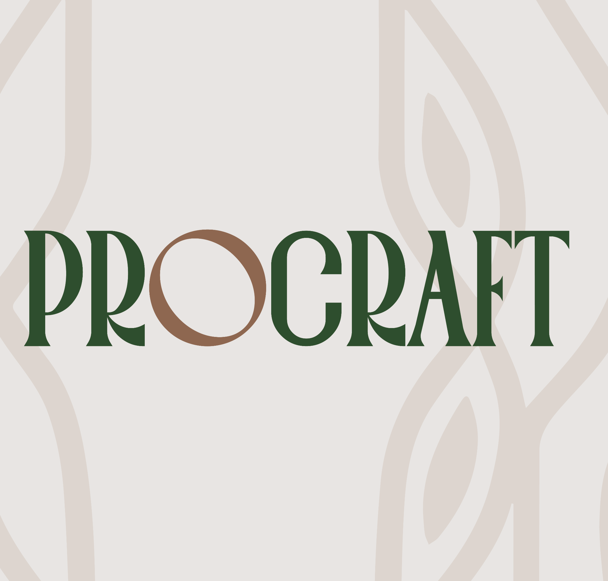
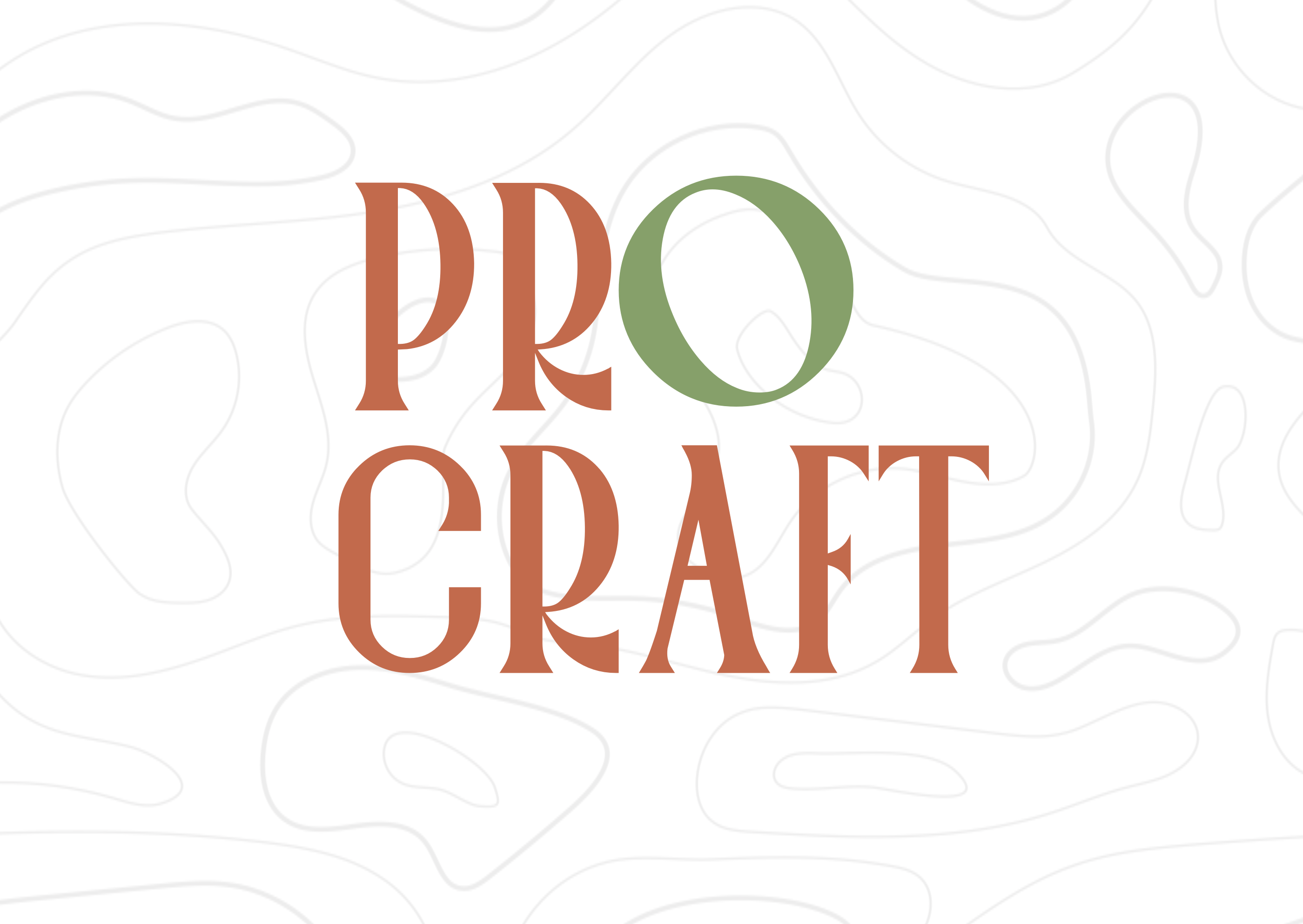
We decided to stick with the option that has the most distinct typeface. The thick letters show sophistication and assertiveness, two characteristics that make clients trust the quality of their services.
Through the process we decided to incorporate the colour red in a different tone from what the competitors were using, to help maintain a connection to the market while still standing out. We added brown as the secondary colour to help tie to the idea that most products were made of wood.
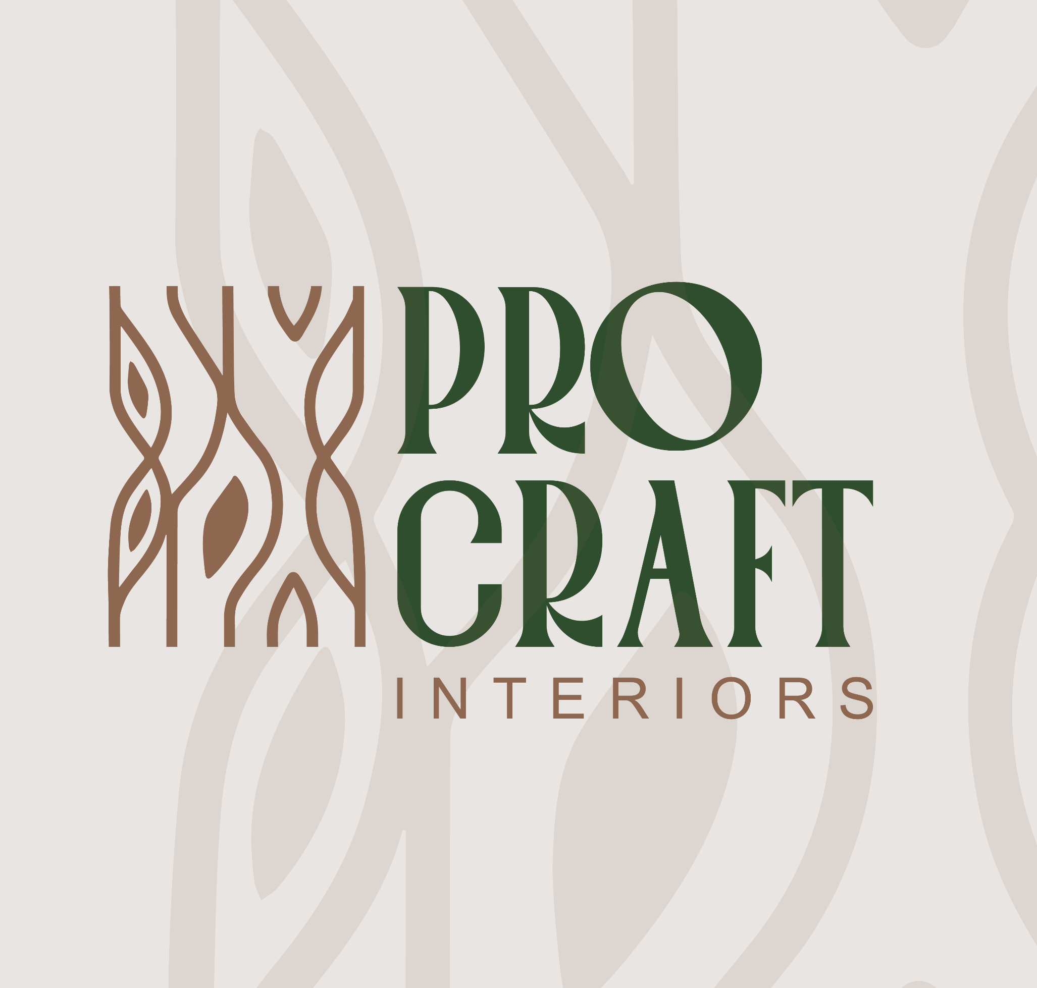
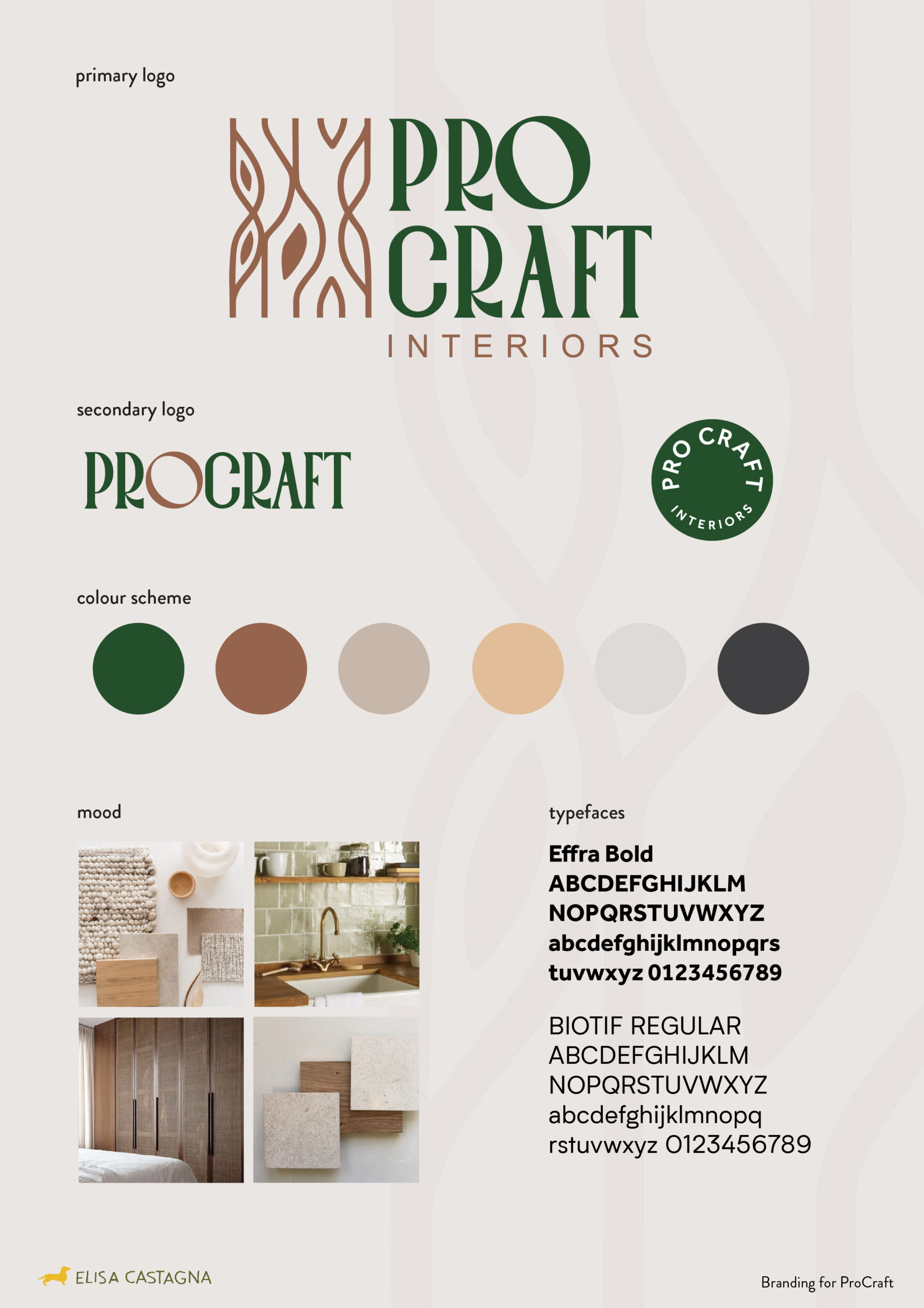
Towards the end of the branding process, we changed gears and decided to include a logo mark and swap out the colour red for a green which symbolises elegance. The purpose of the logo mark was to create a fun design element, that represents tree trunks while also adding a touch of ‘African pattern’ to the design.
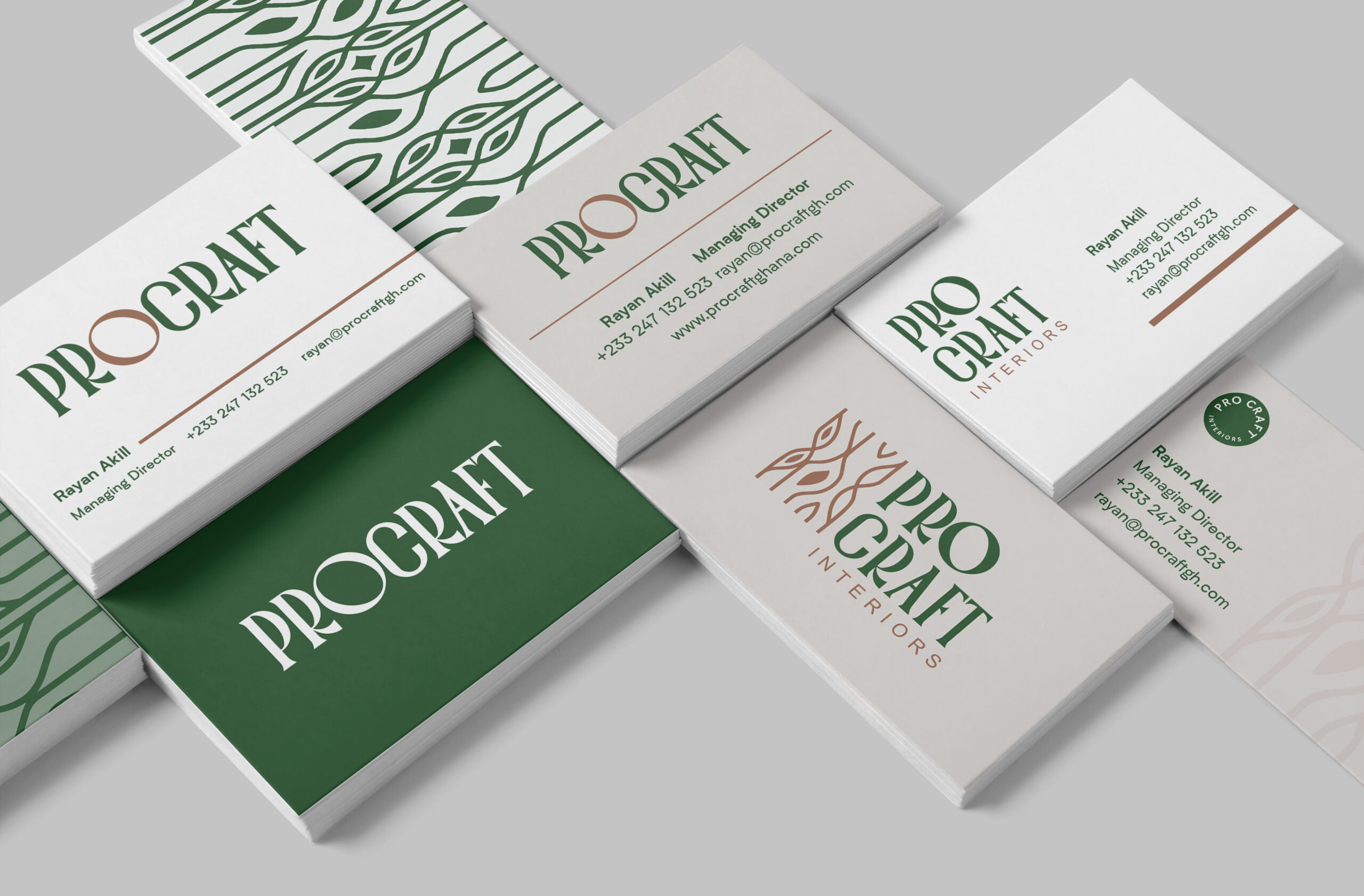
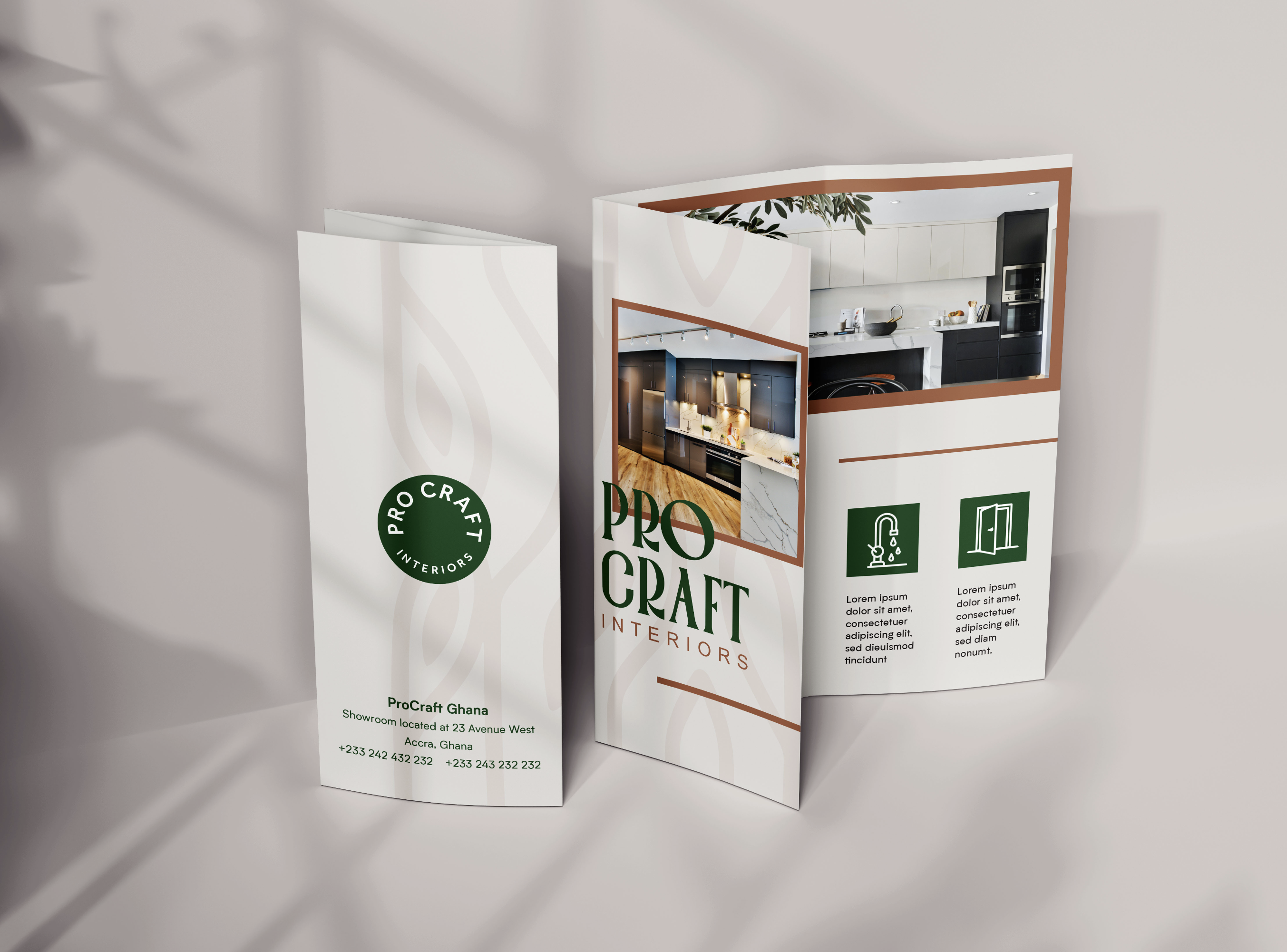
Once the brand identity was finalised we moved on to create business card designs, brochures and social media posts. All of these use the brand colours and elements that tie back to the logo, making it memorable.
Here is the completed brand guide that can be used as a ‘visual road map’ to ensure the continuity of the ProCraft brand.
I am so honoured to have had the opportunity to create this fresh new look for them. Let me know what you think in the comments below.
If you have a brand you want to bring to life with unique colours, logos and illustrations contact me on ecastagna94@gmail.com and let’s chat about it.
No comment yet, add your voice below!