
On a sunny Saturday morning at the Green Butterfly Market, as I had finished setting up my stand, I noticed someone very familiar pass by and after a moment, I recognised it was the mother of a friend back in elementary school. All I could think about was how amazing our minds are. I could not even remember what I ate the night before, yet I can recognise someone I haven’t seen for over 20 years.
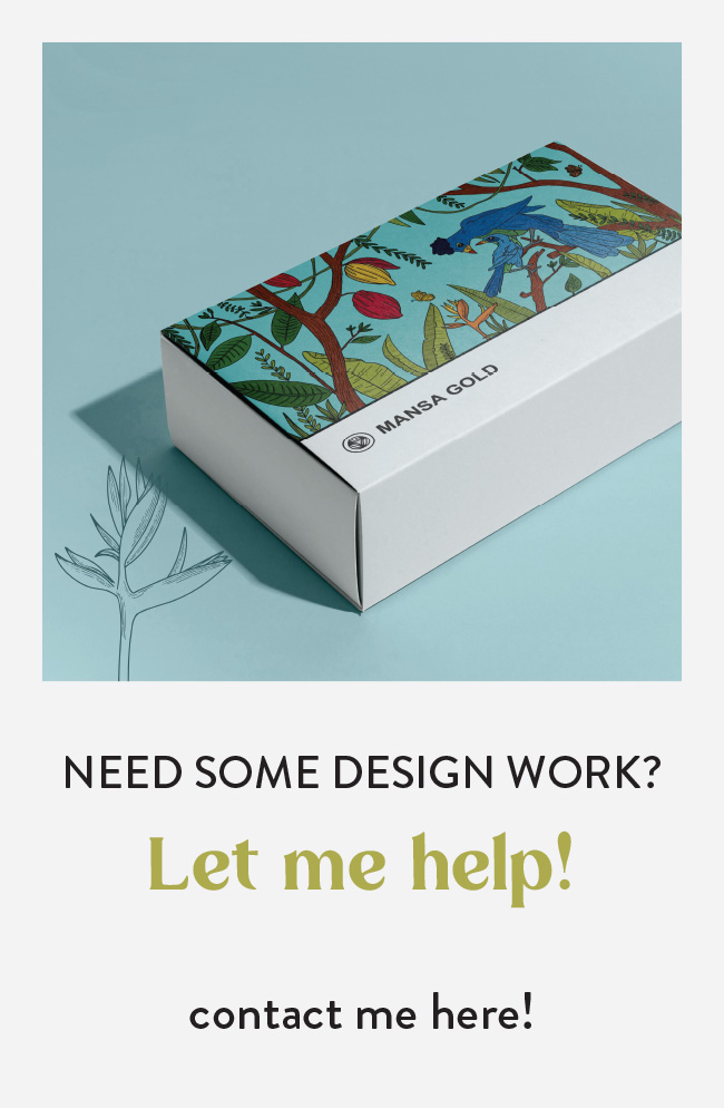
After catching up, we got into conversation about design and illustration and the difficulty in finding designers and illustrators here in Ghana with their own unique style. Preba started Mansa Gold, a chocolate company in 2020 and was looking for an illustrator to help design her new packaging. After agreeing to work together, I was met with the challenge of creating a new design with many interconnected elements in a limited timeframe as we were approaching the Christmas Season.
Looking through the design brief there were a lot of elements they wanted me to incorporate. Different leaves, flowers and animals. I though the best way to approach that was to create a sort of repetitive pattern with lined art and a vibrant colour scheme. However, after showing the initial sketches, the feedback was that they wanted something less static that had more flow.
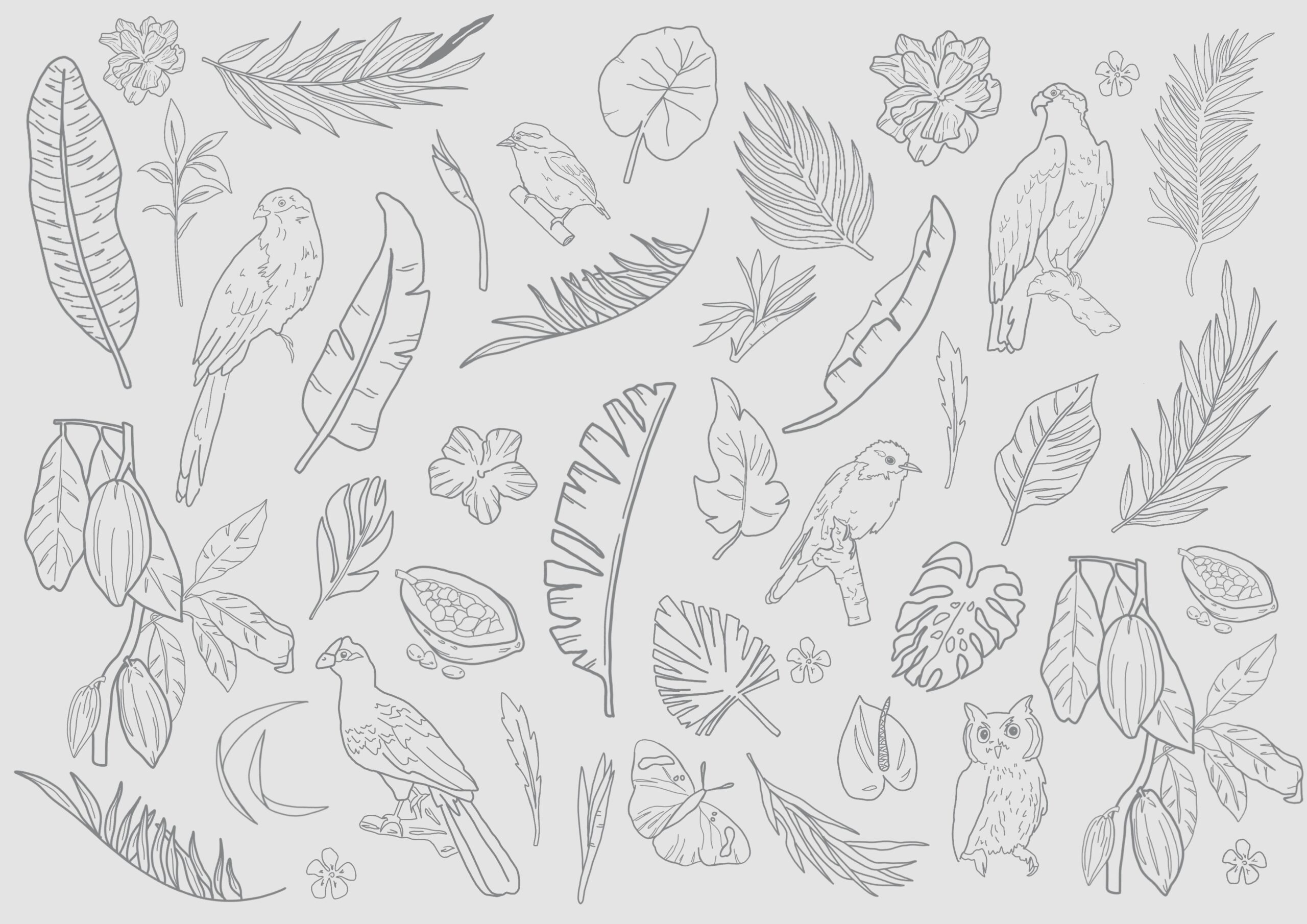
My number one flaw is that although I am a designer, I am not good at explaining my ideas with words. However I have found a very fun way around that. Part of my process includes spending hours on pinterest looking for examples of artwork, images, and colours that I think would help explain my concept. I then look through all the images I gathered and find ways to group them into 3 different categories. These categories become my ‘mood board’. I use these images with a bit of text to explain how each option would look like. I then create a presentation and send to the client.
All images from these mood boards can be found on my pinterest page here.
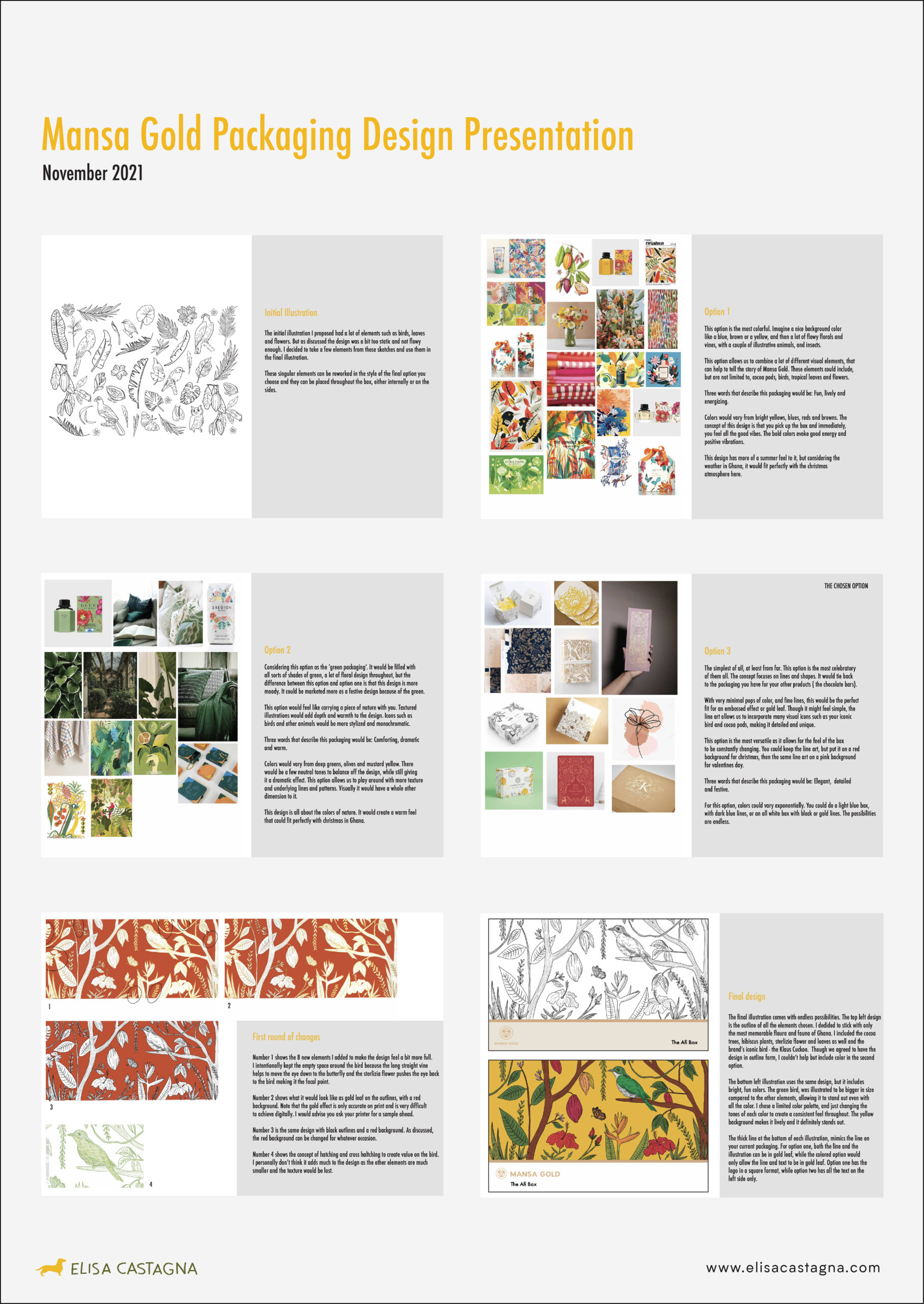
I was personally leaning more towards option 1 and 2 because they resonate more with my artistic style and my love for colour. However Mansa Gold got back to me with their final choice, and can you guess what they picked? Of course the third one (my least favourite). Even though I did not really like this option I presented it anyways because I believed it was in line with what they were asking of me from their design brief.
Once the final illustration was sent out to the client, they came back with a couple of changes. These included having more flowers, less negative space around the bird and some more colour options.
I find it interesting to look back once the design is finished and see how similar the mood board is to the artwork. A little secret though is to bring in a couple of elements from each mood board into the final design!
Overall the design turned out better that I could have envisioned. I like how there are endless possibilities with the final package. As each illustrated element stands on it’s own there are a lot of changes that can be made to the background that would give it a whole new dimension.

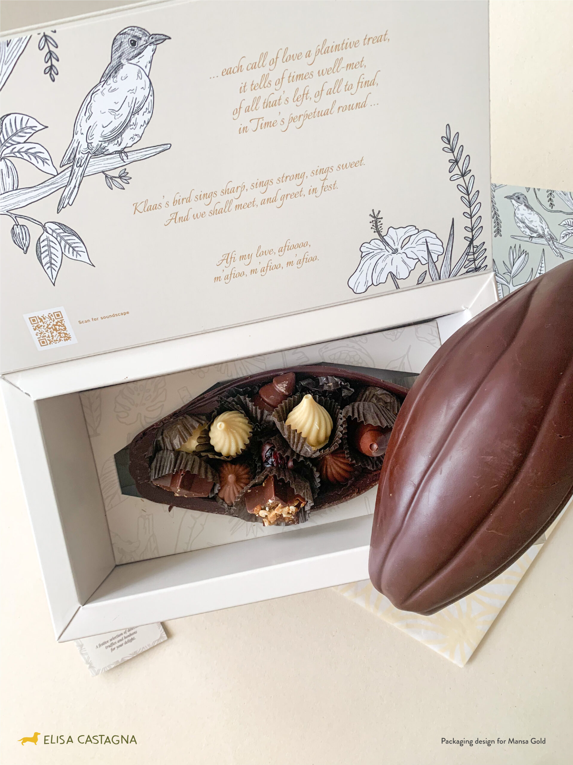
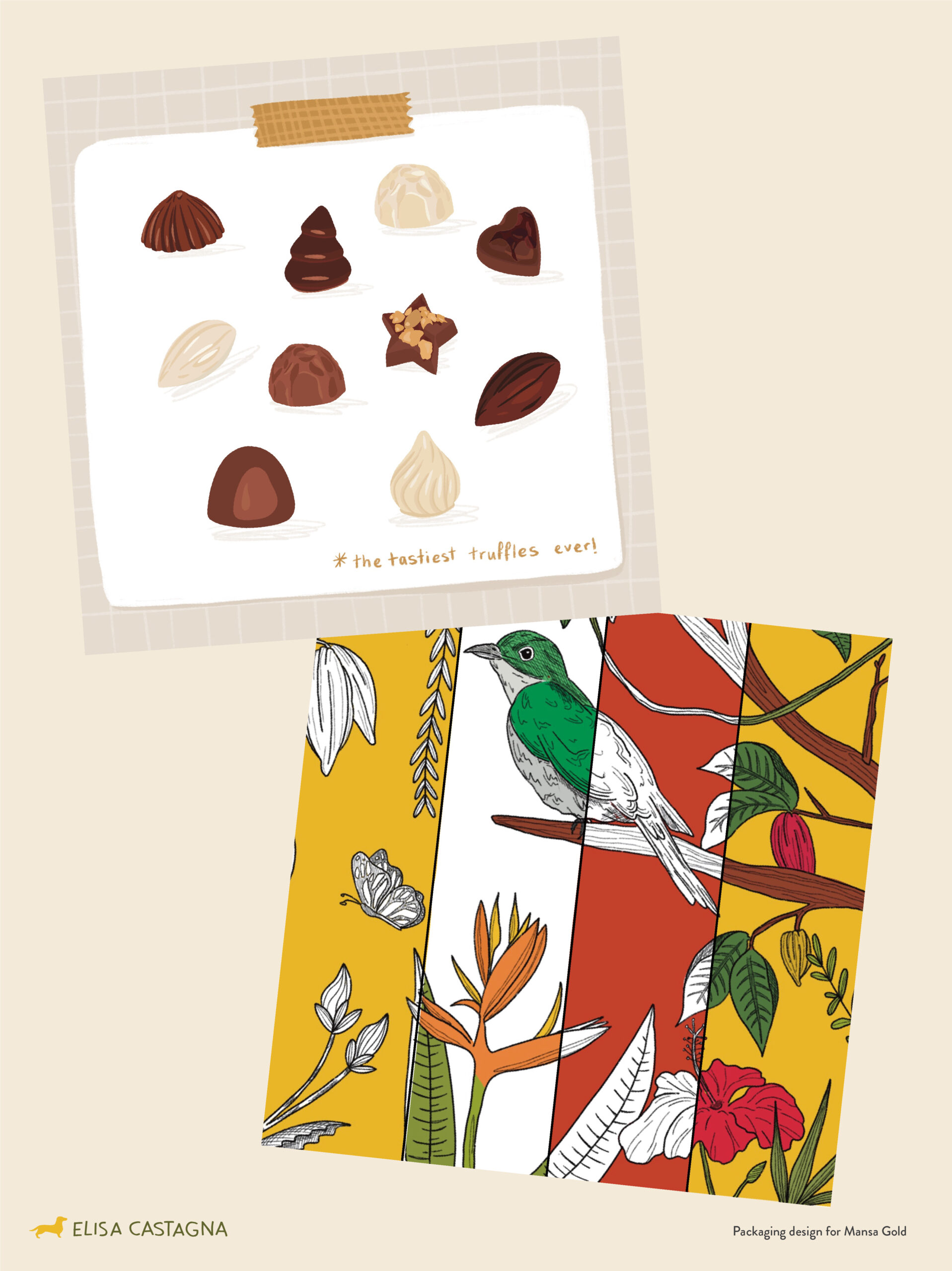
We finished off the project with single illustrations of each truffle that would be included in the box. Overall this project was fun but also tasted amazing!
If you have a brand or packaging you want to bring to life with unique illustrations email me at ecastagna94@gmail.com and I am sure we can create something amazing together!
1 Comment
I enjoyed reading this a lot, thank you for sharing the process!