About a month ago, I was asked to create a logo to be used as an identity and entrance plaque for a house. All I was told was it is for ‘Casa W’
I think it is every designers dream to have such little boundaries with a design, allowing for complete creative control over a project. But it is only when you get such projects that you realise that what makes a difference in a design is the story behind it.
As a dug a little deeper, I found out that the entire home was built around the Vastu system. This is an ancient Hindu scheme of architecture and design that embodies traditional Buddhist beliefs. It’s focus is to eliminate negative energies in a space, while enhancing positive ones.
As the Vastu system was used in the architectural layout of the home, I thought to incorporate it into the logo design too.
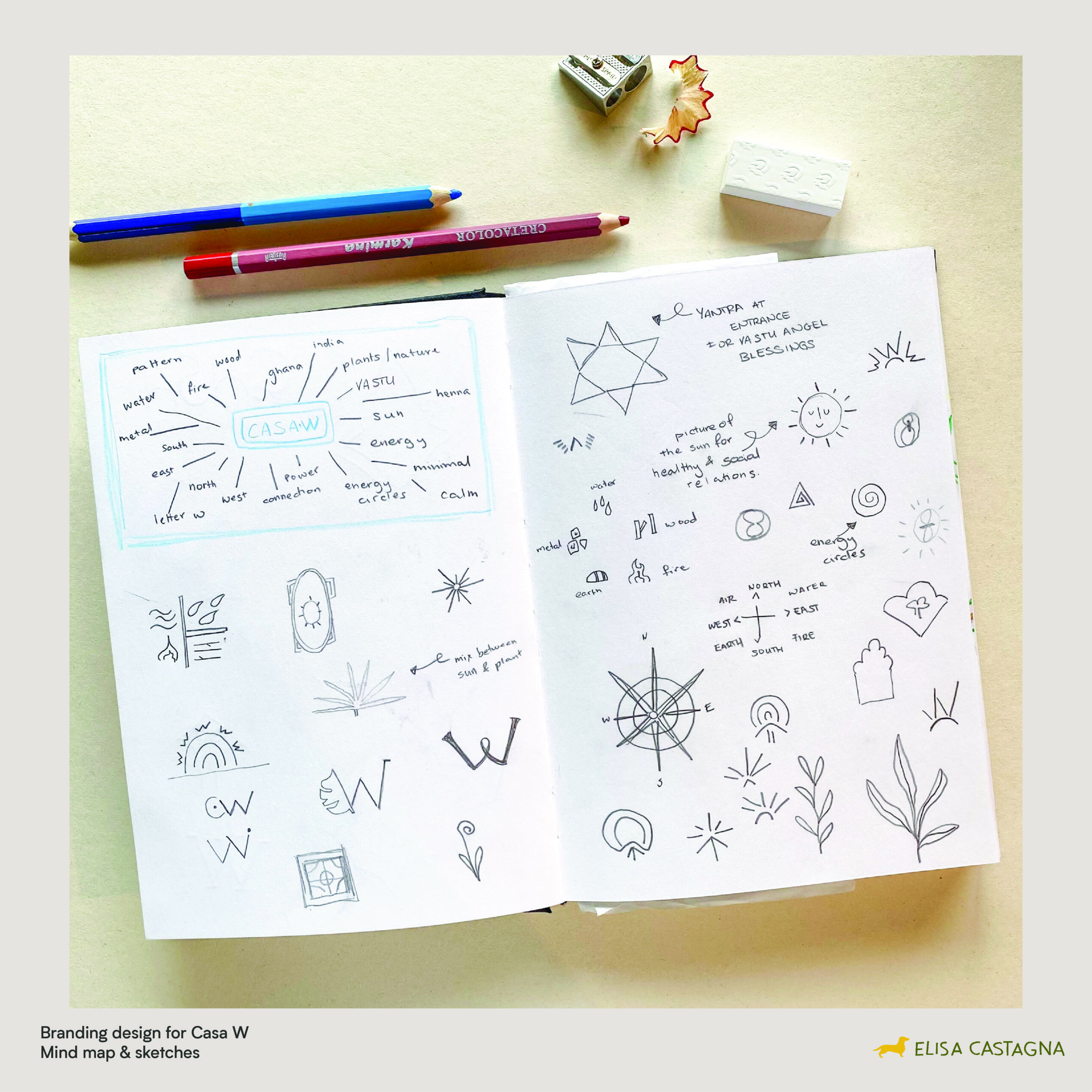
I first started out with a mind map of all the words that I found were relevant to the design. These included; sun, energy circles, north, and east. I then started some quick and simple sketches in my sketchbook. These include floral elements and stylised W’s.
When I create logo designs I always start off with mood boards. This is a collection of images that I group together into different categories. These are then accompanied by a short write up that I use to explain the style and concept of each mood board. I do this so that clients have a visual understanding of what I am going to create. For this specific project I came up with 3 different styles. I have included mood board option 1 here for you to look at.
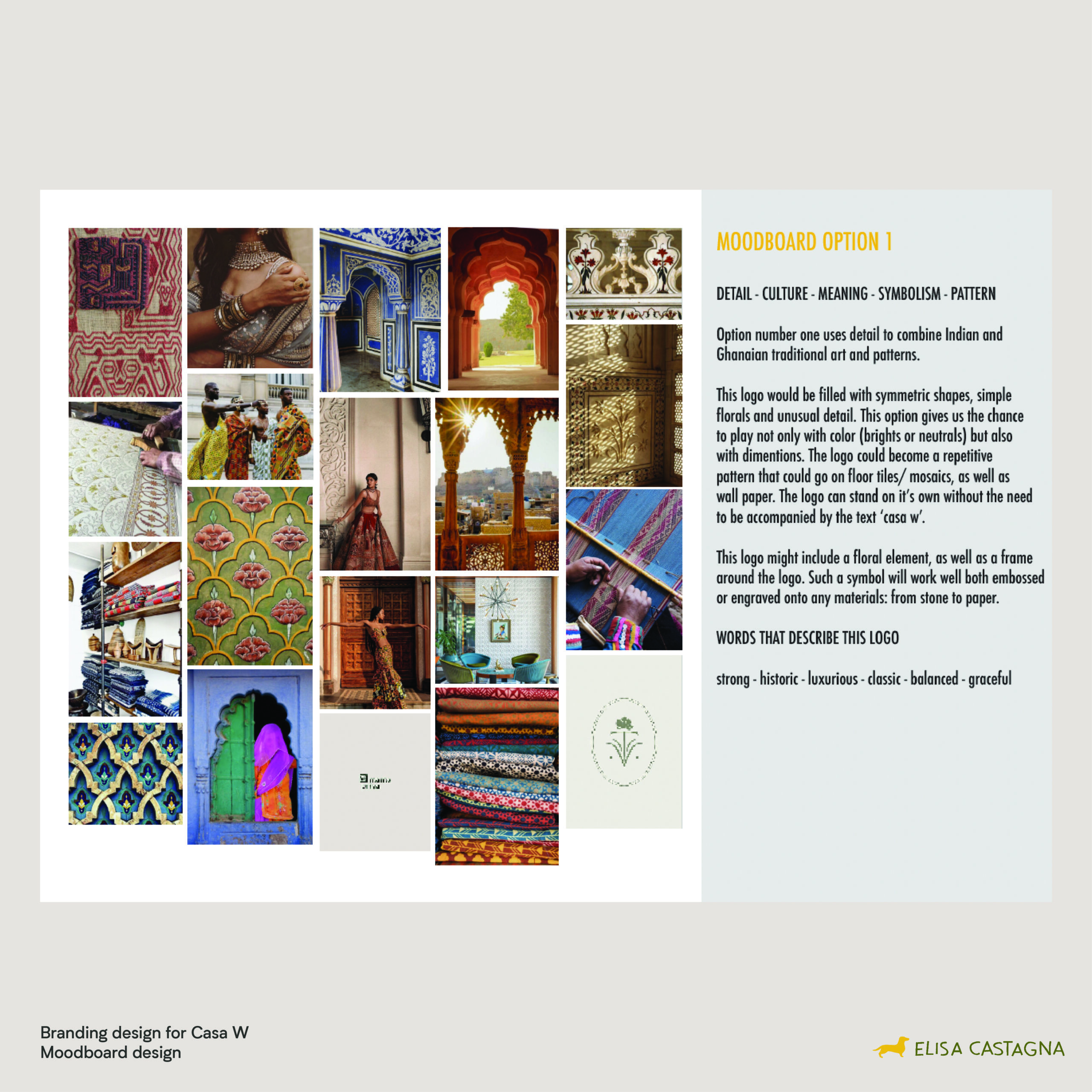
The first option (seen above) uses detail to combine Indian and Ghanaian traditional art and patterns. The second mood board is all about simplicity. With elegant text, light colours and minimal amount of detail. The third mood board ties everything back to nature, with fine lines and a slightly informal illustrative style.
Due to time constrains I immediately started creating 3 different logo options. For the first option I incorporated the letter W with the number 8 ( client’s lucky number) into a circle, which is one of the most important shapes in Vastu. This was a representation of the energy circles that direct positive energy to the right path.
For option number 2, I focused on Indian culture and created an ornate frame surrounding the flower, which has a total of 8 points. This ties back to the lucky number, as well as the points on a compass ( north, north east etc)
For the third option, I focused on symbolism and energy which are extremely important in Vastu. The picture of the sun evokes healthy and social relations, as sunlight is crucial for any house to have positive energy. The sun rays are created through the repetition of the letter W. Following the Vastu system, the preferred position of a sunrise depiction must be on the eastern wall, making this the perfect logo, as the entrance of the home is on the east side.
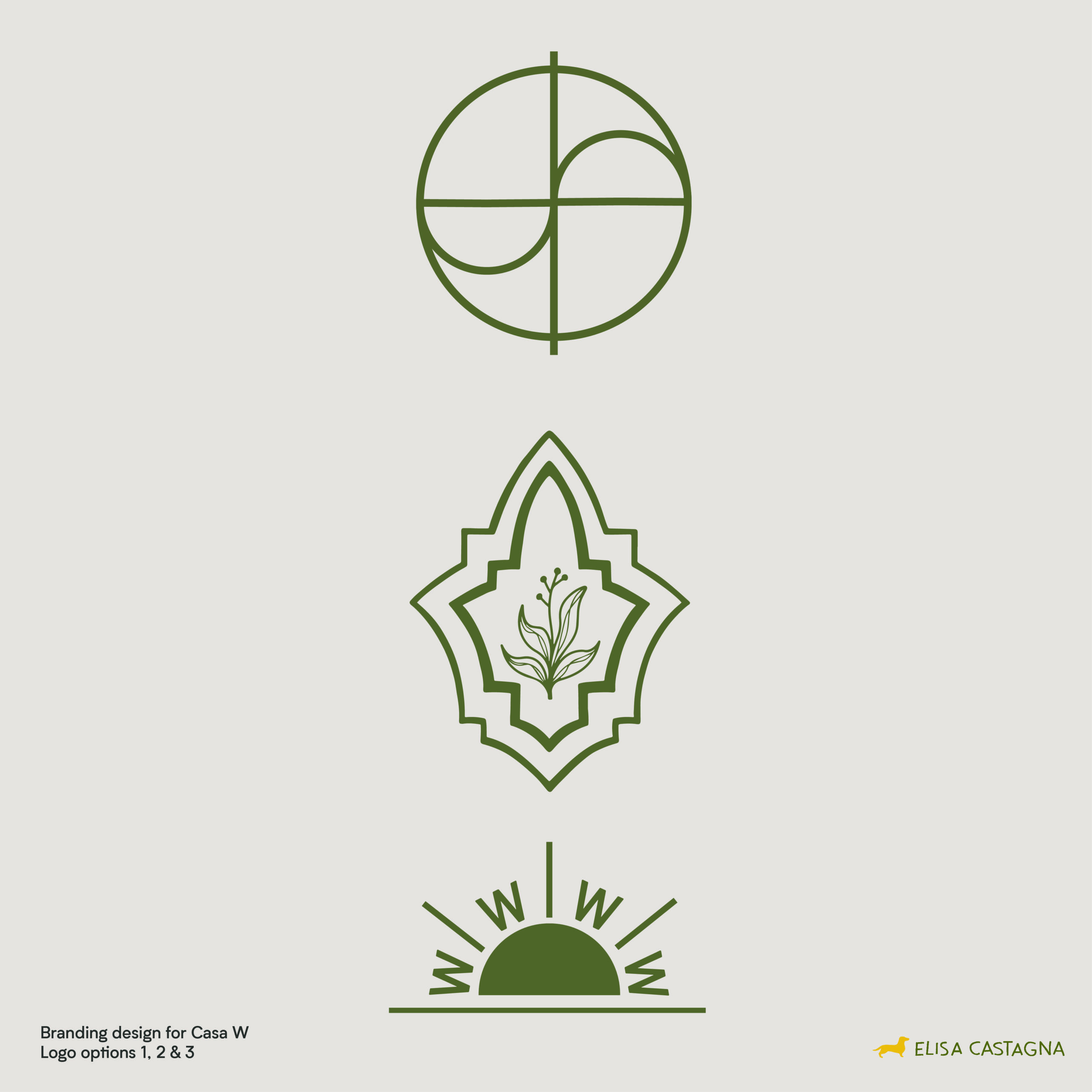
The client chose option number 3, which was actually my favourite. This logo may also be used as embroidery on bedsheets and towels or even a mosaic on the floor.
Overall I was grateful to have dug a little deeper to get more information about the home and how it was built. The Vastu system influenced the logo design, giving it a meaning that I could have never created on my own. This is why I believe design is not just about making something look pretty, design is more about meaning, understanding and expression of unique ideas in visual ways.
I hope you enjoyed reading through the process of creating this logo design. If you have an idea you want to bring to life, contact me on ecastagna94@gmail.com and let’s work together to create some magic!
No comment yet, add your voice below!