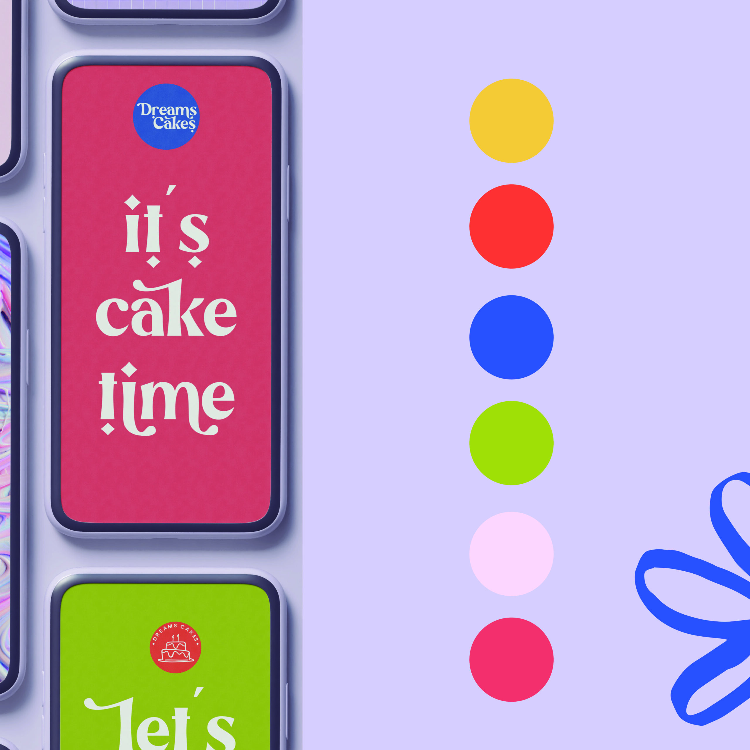
The biggest mistake I see people make as a designer, is choosing one colour just for their logo, without building a colour scheme for the rest of their brand identity.
Assembling the right colour scheme for your brand plays a key role across your various marketing assets.
Brand colours should include between 5 – 10 shades that will be visible throughout the logo, website and other brand assets from print to digital. This ensures consistency and increases brand recognition by up to 80%
Your colour palette should align with your brands values and what you want to communicate to your audience. Remember that colours can mean different things depending on what they are paired with.
Choosing the right colours doesn’t have to be difficult. Here’s a step by step process that will help you simplify this task.
- Establish your brand identity. This is about more than just a logo, it includes crafting a personality. Essentially a brand identity is a group of visual elements for your brand made up of colours, logo variations, typefaces, icons and patterns. All these elements come together to serve as your identity. During this process, think of your brand voice. Is your brand feminine? They maybe focus of gentle tones of peach, pink, beige.
- Explore colour meaning and psychology. A quick online search will do, no need to devour all the content you can find on this topic. The reason this is important is because throughout centuries, humans have learnt to associate meaning to colours. Often times colours make us feel things without us even knowing. Food chains use mostly red because it is stimulating and makes you hungry.
- Search for visual inspiration. It’s normal to think that something isn’t possible until you see it done by others. Maybe you never knew magenta and beige paired well until you saw a packaging in those colours. The more visual inspiration you can find, the more unique your brand colours will be. I have a board on Pinterest with colour inspiration if you want to check it out.
- Pick your primary colour. After doing all of the above, you are ready to pick a primary colour. This should be the main colour of your brand, what you will be mostly recognised for. Don’t just pick a standard colour. Play around with different tones, make it more opaque or brighter. Try to do something unique.
- Choose your secondary colours. This is where it’s good to refer back to all the visual inspiration you got. These secondary colours should work well with the primary colours, they need to work with your main colour, not against it. Play around with different colour schemes such as complimentary, monochromatic or analogous.
- Make the final tweaks. Look at your final brand colours and ask yourself if they come together effectively to create the brand voice you want. You might have to lighten a few shades, or brighten up others, but once that’s done! You have it!
Colours cause you to feel things, and in the long run, people remember feelings, not words. Make sure the feelings you want people to associate with your brand are present in the colours you chose.
In case you need some extra help, here are some great websites that help with colour
https://color.adobe.com/explore


No comment yet, add your voice below!